Introducing Interspan Typeface
by Alfredo Marco Pradil
We at Hanken Design Co.® are thrilled to unveil our latest creation: Interspan, a meticulously crafted sans-serif typeface designed with the unique needs of the technology sector and the discerning eye of the modern designer in mind. For years, Hanken Design Co.® has been dedicated to producing typefaces that embody clarity, functionality, and aesthetic appeal, serving a diverse clientele from burgeoning startups to established global enterprises. Our philosophy centers on creating fonts that not only look exceptional but also perform flawlessly across a multitude of applications. With Interspan, we continue this tradition, offering a versatile and contemporary typeface perfectly suited for digital interfaces, web design, and comprehensive branding initiatives within the fast-paced world of technology.
Our Design Philosophy and Interspan
At Hanken Design Co.®, our guiding principle is to create fonts that seamlessly blend aesthetic elegance with practical utility. We believe that typography should enhance communication without being obtrusive, providing a clear and engaging reading experience. This commitment to simplicity, seamlessness, and functionality is deeply embedded in every typeface we design, and Interspan is no exception. Alfredo Marco Pradil, the founder of Hanken Design Co.® and the creative force behind Interspan, has infused this new typeface with the same meticulous attention to detail and user-centric approach that defines our entire library. As a foundry specializing in sans-serif typefaces, we understand the critical role these fonts play in modern digital communication, and Interspan is specifically engineered to excel in this domain. Our roots in Batangas, Philippines provide a unique perspective that blends global design trends with a dedication to accessible and high-quality typography.

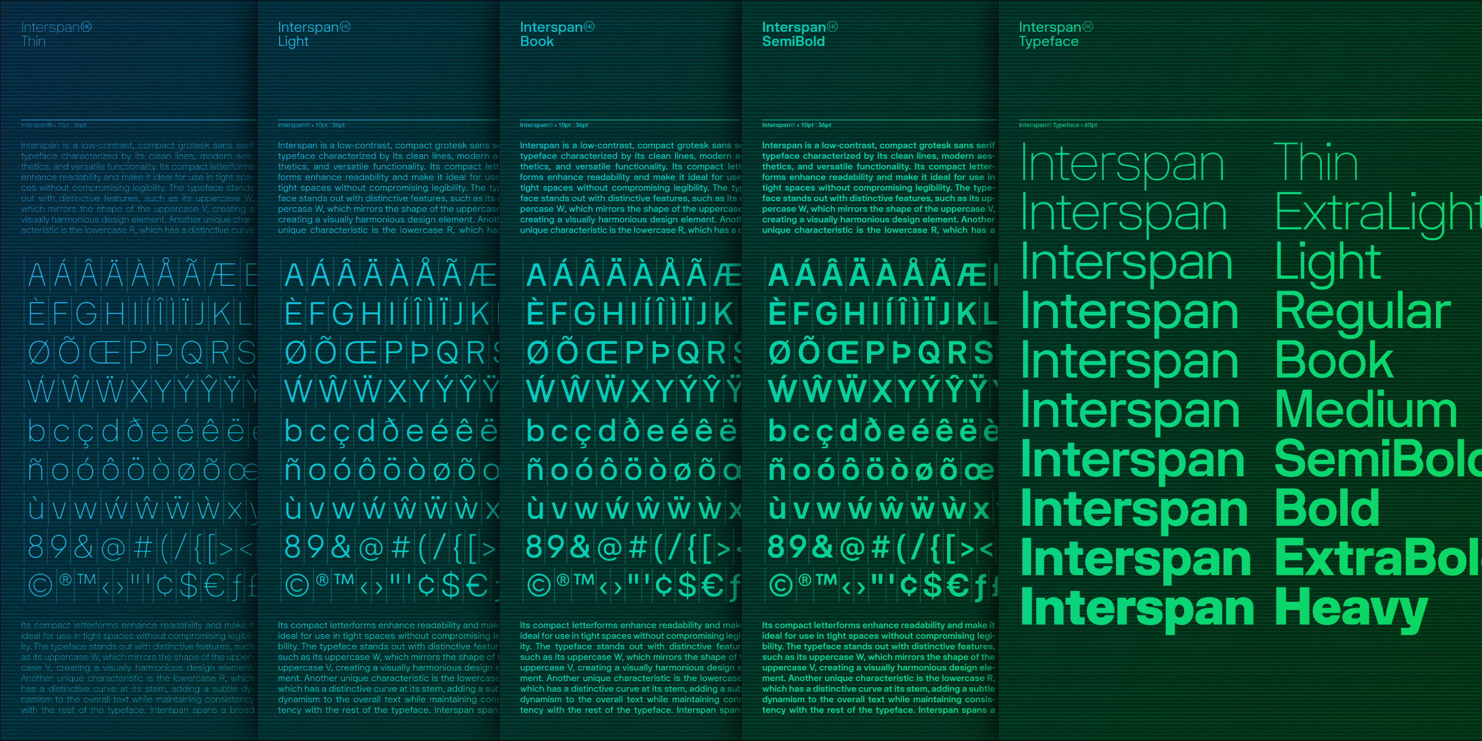
Deconstructing Interspan: Design Characteristics
Interspan stands as a testament to modern sans-serif design, offering a comprehensive palette for any design challenge within the tech sphere. This font family comprises ten distinct styles, ranging from the delicate Thin to the impactful Heavy. The complete list of weights includes Thin, Extra Light, Light, Regular, Book, Medium, Semi Bold, Bold, Extra Bold, and Heavy, providing a full spectrum for establishing clear visual hierarchies.
The design of Interspan is characterized by its low contrast and compact letterforms, resulting in a clean and contemporary aesthetic. Its condensed nature enhances readability, particularly in constrained spaces often encountered in digital interfaces and responsive web designs. A distinctive design element is the uppercase 'W', which subtly mirrors the form of the uppercase 'V', creating a visual harmony throughout the typeface. Additionally, the lowercase 'r' features a gently curved stem, adding a touch of dynamism without compromising the overall consistency and legibility.
Interspan also boasts an extensive glyph coverage. As an example, the Interspan Thin style alone includes 733 glyphs. This comprehensive set encompasses basic characters alongside their Unicode variants and a variety of OpenType features. Designers can leverage these OpenType capabilities to access small caps, stylistic alternates, and ligatures, further refining their typographic compositions. The availability of these ten styles ensures that Interspan offers the versatility needed to address a wide array of design requirements, from body text to impactful headlines.
Interspan: Engineered for the Tech Industry
Interspan has been meticulously engineered to meet the demands of the technology industry. Its clean lines and modern aesthetic make it an ideal choice for crafting intuitive and engaging digital interfaces and websites. The inherent readability of Interspan, even in its lighter weights, ensures a comfortable user experience across various screen sizes and resolutions. The condensed letterforms are particularly advantageous in user interfaces where space is often at a premium, allowing for efficient information display without sacrificing clarity.
For technology companies looking to establish a strong and contemporary brand identity, Interspan offers a versatile solution. Its professional yet approachable demeanor makes it suitable for a wide range of branding materials, from logos and marketing collateral to comprehensive brand guidelines. Recognizing the critical role of web presence for tech companies, Interspan is available in webfont formats, allowing for seamless integration into websites through the @font-face rule. Similarly, its legibility and clean design make it an excellent choice for embedding in app interfaces, ensuring a consistent brand experience across all digital touchpoints. Beyond websites and apps, Interspan's versatility extends to electronic documents, digital advertisements, and email communications, making it a truly comprehensive typographic solution for the tech industry.
Interspan in Practice
While Interspan is a recent addition to our library, its design characteristics lend themselves perfectly to various applications within the technology sector. Imagine Interspan providing the clear and concise typography for the user interface of a cutting-edge software application, guiding users with its effortless readability. Consider a tech company's website, where Interspan's modern aesthetic reinforces its innovative spirit and professional image. For a new tech startup aiming to make a bold statement, Interspan can form the cornerstone of its branding, conveying both sophistication and approachability. In marketing materials for a groundbreaking digital product, Interspan's clean design ensures that the message is conveyed with clarity and impact. Even in the realm of technical documentation and reports, Interspan's legibility ensures that complex information is easily digestible. The related tags on MyFonts, such as "Technology," "Technical," and "Clean" further underscore its intended application within this dynamic industry. We are excited to see how designers and tech companies will integrate Interspan into their projects and invite you to share your creations with us.
Technical Specifications and Licensing Options
Interspan is offered with a comprehensive set of technical specifications across its ten styles. While the detailed specifications for each weight are available on the MyFonts product page, the family as a whole provides a consistent and harmonious visual experience. To accommodate the diverse needs of our users, Hanken Design Co.® offers a variety of licensing options for Interspan. These include licenses for webfonts, allowing embedding on websites using the @font-face rule; desktop use, for applications such as design software; embedding within mobile applications for iOS, Android, and Windows Phone; use in electronic documents like eBooks and interactive PDFs; and for digital advertising and email campaigns. While the specific file formats such as OTF, TTF, WOFF, and WOFF2 are not explicitly listed in the provided snippets, these industry-standard formats are typically included with our font packages to ensure broad compatibility across different platforms and design tools. Each license is governed by its respective End User License Agreement (EULA), providing clear guidelines on usage.
Interspan Licensing Options
|
License Type |
Intended Use |
|
Webfonts |
Embedding on websites using @font-face rule. |
|
Desktop |
Use in desktop applications (e.g., design software). |
|
App |
Embedding in iOS, Android, or Windows Phone mobile applications. |
|
Electronic Doc |
Embedding in eBooks, eMagazines, interactive PDFs. |
|
Digital Ad/Email |
Embedding in HTML5 digital advertisements and emails. |
Recognition within the Design Community
As a newly released typeface, Interspan is beginning its journey within the design community. However, Hanken Design Co.® has a well-established reputation for crafting high-quality typefaces, as evidenced by our presence on platforms like YouWorkForThem and MyFonts. We are confident that Interspan, with its thoughtful design and versatility, will resonate with designers and tech companies seeking a modern and functional sans-serif solution. We encourage you to explore the Interspan product page on MyFonts for any testimonials or further endorsements as they become available.

The Interspan Advantage: Comparison with Leading Sans-Serif Typefaces
In the vast landscape of sans-serif typefaces, Interspan distinguishes itself through a combination of considered design choices tailored for the technology sector. While other popular fonts like Inter, Roboto, Open Sans, Lato, and Montserrat also serve the needs of digital design, Interspan offers a unique perspective. It is important to note that while our typeface shares a phonetic similarity with "Inter", designed by Rasmus Andersson, Interspan is a distinct creation by Alfredo Marco Pradil under the Hanken Design Co.® foundry.
Roboto, developed by Google, is known for its dual nature, blending a mechanical structure with friendly open curves and serving as the default font for Android. Open Sans, a humanist sans-serif commissioned by Google, offers open forms and a neutral yet approachable feel, optimized for web and mobile interfaces. Lato, designed by Łukasz Dziedzic, is a humanist sans-serif aiming for a transparent feel in body text while retaining originality in display sizes. Montserrat, inspired by historical signage in Buenos Aires, is a geometric sans-serif with a prominent x-height, popular for web design.
Interspan distinguishes itself through its specific design details like the mirrored 'W' and 'V' and the curved 'r', its compact nature enhancing readability in tight spaces, and its explicit focus on the technology industry. These features, combined with its comprehensive range of ten styles, make Interspan a compelling alternative for designers seeking a modern and versatile sans-serif tailored for the unique demands of the tech world. The ongoing trend in UI/UX design favors clean, geometric, and highly readable sans-serif typefaces, and Interspan aligns perfectly with these contemporary preferences.
